 Vecto
VECTOFOX FIELD NOTES
Prepare an SVG for embroidery: logo cleanup before digitizing
Prepare your logo at its intended size in millimeters, inspect small features, and simplify the artwork deliberately before digitizing it into stitches. The six downloadable before-and-after pairs below show specific edits you can inspect and repeat. An ordinary SVG describes artwork; a machine embroidery file also needs a stitch plan.
VectoFox documentation · Updated
Separate SVG preparation from embroidery digitizing
PNG to SVG tracing gives you editable filled contours. It does not decide needle movements, stitch density, sewing order, fabric compensation or which details belong in the final design. Use VectoFox to obtain an artwork starting point, then continue in dedicated digitizing software.
Ink/Stitch documents vector preparation before stitch setup, sequencing, preview and a test run. Its workflow is a useful next step after this guide; the edits below stop at artwork geometry. VectoFox does not currently provide an uploaded-SVG checker or DST/PES export.
Set the finished size before judging small details
Choose the intended artwork dimensions in millimeters, not only a pixel width. A thin feature that looks clear when enlarged on screen may occupy very little physical space in the finished piece. Distinguish the document or hoop area from the actual bounds of the logo.
For an unrotated feature after accounting for group scaling: feature size in mm = feature size in viewBox units ÷ document viewBox width × document width in mm. The examples use matching aspect ratios. At 60 mm across a 128-unit document, one horizontal or vertical unit represents 0.46875 mm.
The measurements here are selected feature sizes, not universal embroidery limits. The appropriate redesign depends on stitch construction, thread, fabric and the intended appearance. Confirm those choices in the digitizing workflow and a sew-out.
Example 1: redraw a thin filled stroke
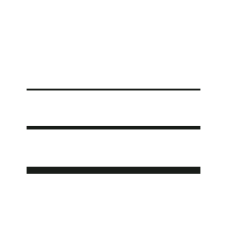
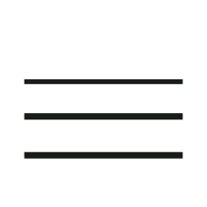
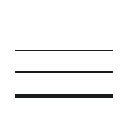
The before file uses the three opaque contours from our published thin-lines Balanced trace, placed on a 60 × 60 mm document. The selected top contour is one unit high, or about 0.469 mm. The after file deliberately thickens it to three units, or about 1.406 mm; the middle contour is also thickened.
On a copy in a vector editor, select the intended filled shape and adjust its boundaries rather than applying a global simplification to the whole design. In this exercise the top boundary changes to y=49 and the bottom to y=52 in a 128-unit viewBox. Compare the other lines before saving.
The path count stays at three, despite a visible change. This edit also does not turn a filled contour into a running-stitch centerline. The faint fourth line already lost during tracing is not restored by thickening the surviving paths.
| Measure | Before | After |
|---|---|---|
| Document width | 60 mm | 60 mm |
| Visible paths | 3 | 3 |
| Selected top stroke thickness | 0.469 mm | 1.406 mm |
Example 2: give small outlined lettering more room
These original block glyphs come from the tiny-glyphs Balanced trace, not a licensed font or OCR. Both files have a 24 × 15 mm document. The before file places the paths in a half-scale group; removing that placement scale in the after file increases the first glyph height from 2.625 to 5.25 mm.
Select the lettering group in a vector editor, enlarge it with proportions locked, and allocate more space in the layout. Inspect the counters and spaces between letters afterward. If the design cannot accommodate larger lettering, shortening it or rebuilding it with suitable embroidery lettering may be preferable.
The enlarged example remains three filled outline paths. It has not gained font editing or satin-column construction. For a digitized lettering alternative, review Ink/Stitch’s lettering tool and the size range of the selected font.


| Measure | Before | After |
|---|---|---|
| Document width | 24 mm | 24 mm |
| Visible paths | 3 | 3 |
| First glyph height | 2.625 mm | 5.25 mm |
Example 3: remove unwanted fragments selectively
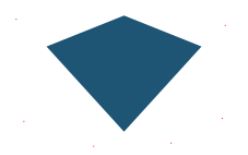
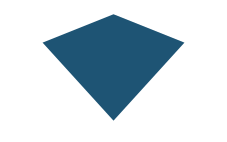
The controlled badge exercise contains one main shape and six deliberate stray squares. A measured square is 0.3 × 0.3 mm on the 60 mm document. Removing just these six unwanted objects leaves one visible path. The main shape is unchanged.
Inspect scattered objects at the intended size, select only those you have identified as unwanted, and remove them from a copy. Dots, punctuation, registration marks or decorative accents may be intentional. A size threshold alone cannot make that decision.
Ink/Stitch’s Cleanup Document documentation includes a test-run option that lists affected objects before removal. Use that review step if you continue there; the example here was edited directly and does not demonstrate an application-level cleanup test.
| Measure | Before | After |
|---|---|---|
| Document width | 60 mm | 60 mm |
| Visible paths | 7 | 1 |
| Unwanted islands in this exercise | 6 | 0 |
Example 4: widen a specific gap deliberately
In this controlled 40 mm-wide exercise, the two colored shapes are separated by one viewBox unit: 0.4 mm. The after file keeps the left boundary at x=49 and moves the right shape’s inner boundary from x=50 to x=53. That creates a 1.6 mm gap while keeping the outer right boundary in place.
In a vector editor, select the facing boundary nodes and move them intentionally, then inspect the proportions of both regions. This changes the artwork. It is not an automatic repair or a prediction that the wider opening will survive every fabric and stitch setting.
Bounding boxes work for this axis-aligned pair of rectangles. They are not a general method for finding the narrowest distance between curved letters or irregular shapes.


| Measure | Before | After |
|---|---|---|
| Document width | 40 mm | 40 mm |
| Visible paths | 2 | 2 |
| Selected horizontal gap | 0.4 mm | 1.6 mm |
Example 5: choose how to handle a gradient
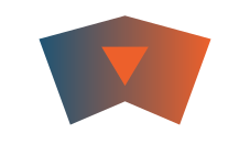
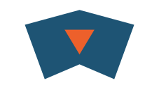
The controlled color exercise starts with a blue-to-orange gradient and an orange accent. The after file replaces the main gradient with a solid blue fill while retaining the accent. Both files contain two visible paths; the number of gradient definitions changes from one to zero.
For a flat-color result, select the region and choose a solid fill as a deliberate design decision. Do not treat all intermediate shades in a traced gradient as separate thread requirements. Decide which color regions actually matter to the mark.
A gradient is not universally invalid: Ink/Stitch also documents a specialist Linear Gradient Fill method. Choose between that workflow and a simpler flat palette rather than promising that deleting gradients is always the correct fix.
| Measure | Before | After |
|---|---|---|
| Document width | 60 mm | 60 mm |
| Visible paths | 2 | 2 |
| Gradient definitions | 1 | 0 |
Example 6: preserve a hole when changing clipped artwork
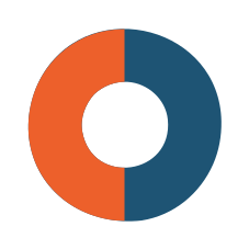
The before ring adapts the real alpha-ring Balanced SVG and contains one clipPath definition. The after file is a deliberate redraw into two regular annular half-paths, with no clipping definition. It preserves an empty center but regularizes the traced curves; it is not a lossless conversion of arbitrary clipped artwork.
For a similarly simple emblem, work on a duplicate and rebuild the intended colored regions and opening as explicit paths in your vector editor. Compare the silhouette, both color boundaries and the hole over a contrasting background. For complex masks, retain the original and investigate the target editor’s behavior before changing the structure.
Do not simply delete clip definitions from a traced SVG: geometry previously hidden by the clip can become visible. In the two files shown here, ImageMagick probes at the center of a 256 × 256 raster both returned alpha 0, while the selected left and right interior points retained the intended colors. This checks those points, not stitch quality.


| Measure | Before | After |
|---|---|---|
| Document width | 60 mm | 60 mm |
| Visible paths | 2 | 2 |
| Clip-path definitions | 1 | 0 |
Review text, images, masks and overlapping shapes
For an SVG received from another source, inspect whether it contains live text, embedded raster images, filters, masks, clipping or partly transparent fills. These elements need a decision in the target workflow; an SVG filename alone does not establish that the visible image consists of editable paths.
VectoFox’s own traced downloads contain filled paths rather than live text or an embedded copy of the raster source. They may use a clipPath for transparent silhouettes. An outline of a letter is editable geometry, but the original font and text content have not been recovered.
Also inspect overlaps and object ordering. A normal browser preview shows the visible composite, so it can hide geometry behind other shapes. Do not automatically merge colors, remove hidden paths or reorder objects without comparing the intended artwork and downstream interpretation.
Continue in Ink/Stitch, then sew a test
The following handoff follows the official documentation; it was not tested inside Ink/Stitch for this publication. Keep the original trace and the edited artwork as separate files so you can return to either.
- Open a copy in the target editor and confirm the artwork’s physical size and proportions.
- Inspect the shapes and resolve any reported object problems. Review removal candidates before applying cleanup.
- Choose stitch constructions and parameters for the intended material, then plan the sewing sequence.
- Inspect the generated stitch simulation and export the format required by your machine.
- Sew a test with the intended type of fabric and stabilizer. Adjust the design from what that test reveals.
Can an ordinary SVG be used directly as a DST or PES file?
No. Renaming an SVG to .dst or .pes does not digitize the design. A stitch-generation workflow must interpret the artwork and write the machine’s instructions. VectoFox currently exports SVG artwork only.
An SVG can also hold embroidery-specific metadata added by another application. That does not mean every path-based SVG already contains such settings. Keep the distinction between artwork, an editable digitizing project and a machine export clear.
Neither a clean browser preview nor the after files on this page establish that a design is ready to sew. Use the samples to practice artwork decisions, then validate the resulting stitch plan and physical output separately.
Download the evidence and repeat the geometry checks
Every pair includes the exact before and after SVGs, with physical dimensions stored on the root element. Three pairs link the original committed Balanced trace as well. The manifest records file hashes and provenance; the results record selected browser measurements and the ring’s raster probes.
Open a pair in a browser or vector editor and compare the same document area. Check the declared dimensions, inspect the selected paths and repeat the indicated edit on a copy. Geometry measurements account for the placement scale used in the small-lettering example.
These six controlled exercises are not customer failure reports, a cross-product comparison or sew-out evidence. Fewer paths and wider features are not scores of embroidery quality. Use the measurement record to understand what changed, rather than treating the after file as a certified result.